Easy like Sunday morning: Logos!
The Hindu
The Hindu Sunday quiz on ‘Logos!’ by Berty Ashley
1. On October 29 in 1863, this humanitarian institution was founded, which has been a three-time recipient of the Nobel Peace Prize, including for its founder Henry Dunant. Dunant designed its logo as a tribute to the flag of his home country, showcasing the same design with the colours inverted. Which organisation’s logo is this, its simple design being a huge relief when seen in a war zone?
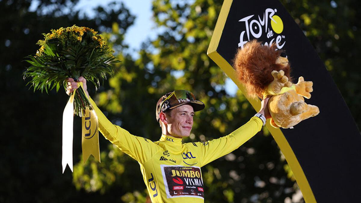
2. The Tour de France is one of the world’s toughest sporting events since 1903. After a hundred years, the event underwent re-branding and a new logo was designed by Joel Guenoun. It is a simple brush script of the words ‘Le Tour de France’ with a splash of yellow below the letter ‘R’. The colour is a reference to the jacket given to the winner of each stage. Guenoun designed the letters ‘OUR’ to look like something — what was that?
3. The logo for ‘Yoga Australia’ is a simple black silhouette of a woman doing the ‘Natarajasana’, also known as the ‘dancer’s pose’. It features a person standing on one leg, and raising the other leg behind them to hold the ankle with one hand as the other hand stretches forward. Using the concept of negative space, how does the logo depict Australia?
4. The Bronx Zoo is one of the largest zoos in the US and is situated in New York City. The city itself is instantly identifiable by its skyline of skyscrapers — three skyscrapers are identifiable in the negative space between the legs of an animal that seems to loom over the city. What animal is shown in the logo, which might look into a window on the third floor?
5. Circus of Magazines is an online marketplace for magazines. Its logo cleverly represents the online community, a place where magazine lovers gather to exchange magazines. It shows a plain black, vertically placed magazine open, with its pages spread out. What does this look like — that makes a reference to the name of the community?
6. The logo of this company is a reference to multiple things in the history of this iconic, triangular, white nougat chocolate created in the city of Bern in Switzerland. The logo features the nearby Matterhorn Mountain, and hidden inside the mountain is a bear on its hind legs, a reference to the coat of arms of Bern. Which chocolate brand is this?
7. This company’s logo is just the website name in white sans seriff officina font on a black background. There is a yellow curved line at the bottom that looks like a smile — it reaches from the first letter in the name to the fourth. Which company is this that pretty much sells things under every letter in the alphabet?


