Mixed reaction from locals about former Sask. Roughrider’s comments on Pride logo
Global News
There's been mixed reaction from locals on comments made by John Chick, a former Saskatchewan Roughrider who said on social media the team's Pride logo is an 'embarrassment.'
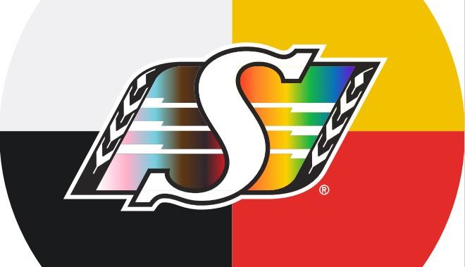
To kick off Pride month and Indigenous History Month, the Saskatchewan Roughriders launched a new logo as a token of their support.
On June 1, the logo was unveiled. It shows a medicine wheel with four colours that are significant in the Indigenous culture. The Roughriders logo also incorporates the colours of the Pride flag.
But some people were not in favour of the change.
John Chick, who spent six CFL seasons with the Saskatchewan Roughriders before being released in 2016, said the logo is “an embarrassment (to) what sports and entertainment have become.”
“… Instead of just focusing on football, you wave that ridiculous flag for an entire month while wanting people to take your business seriously,” stated Chick in a Facebook post. “If some business like the CFL put a cross on their logo for even a day, there would be an uproar.”
Local resident Lucille Carlston disagreed with Chick’s comments.
“I don’t think he’s right. I think everybody should be supported,” said Carlston, who adds that it’s important for companies like the Saskatchewan Roughriders to be an example. “They expect us to show their support, right?”
Global News interviewed several people who also disagreed with Chick’s comments but also a few others who agreed.


